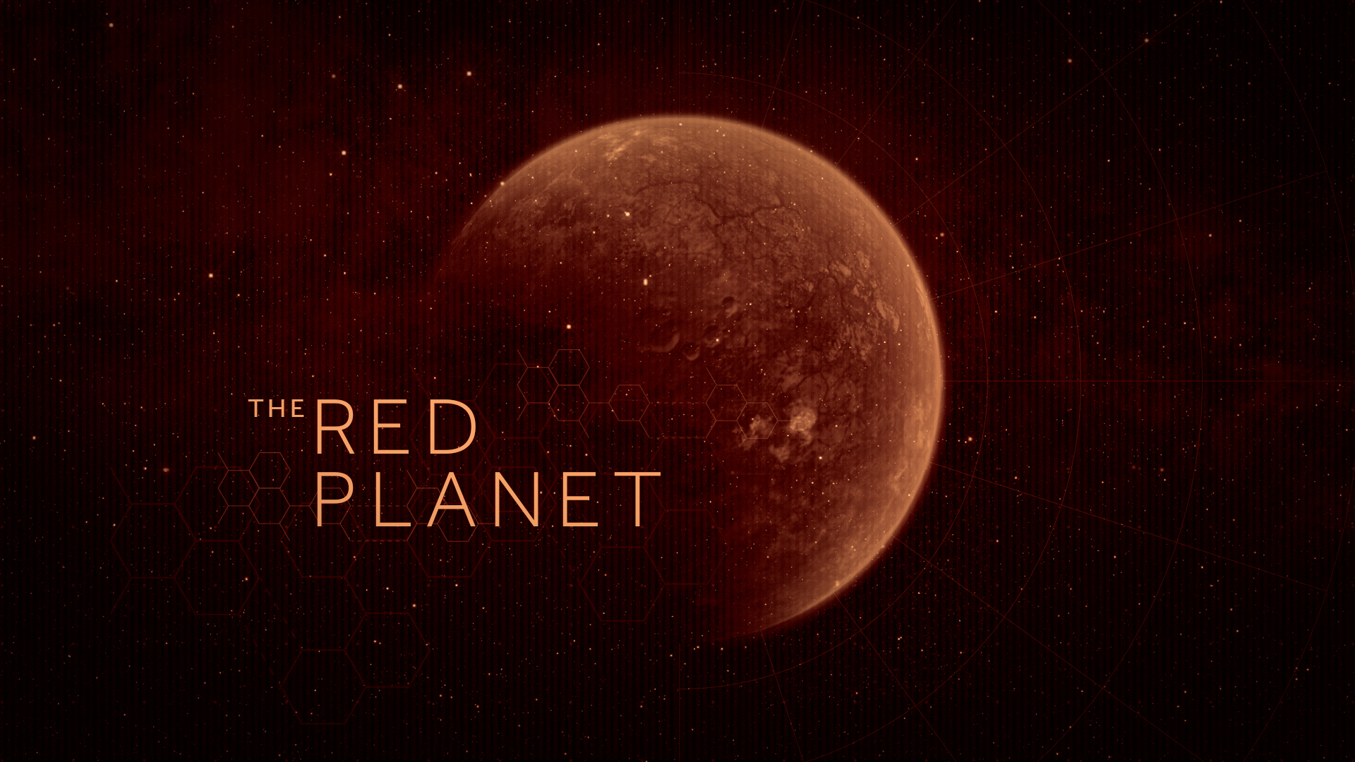
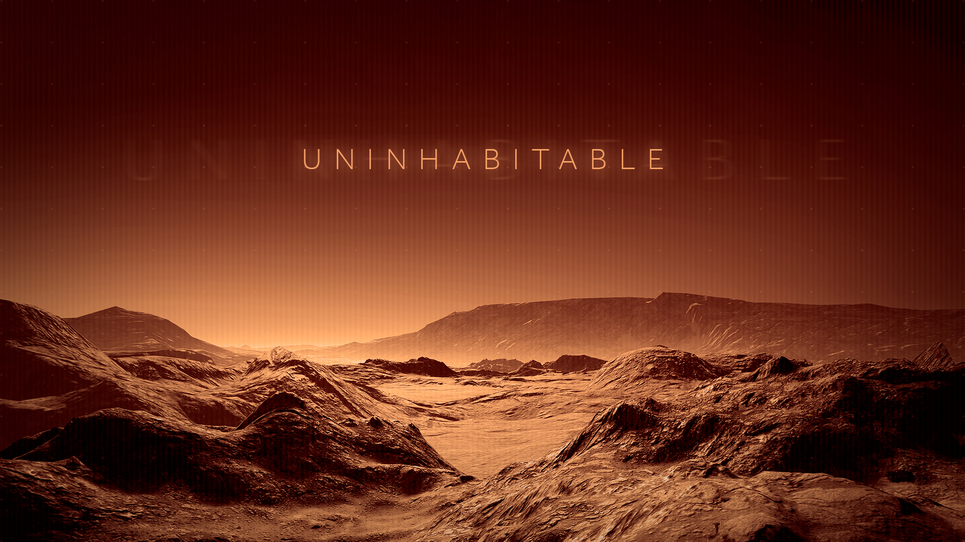
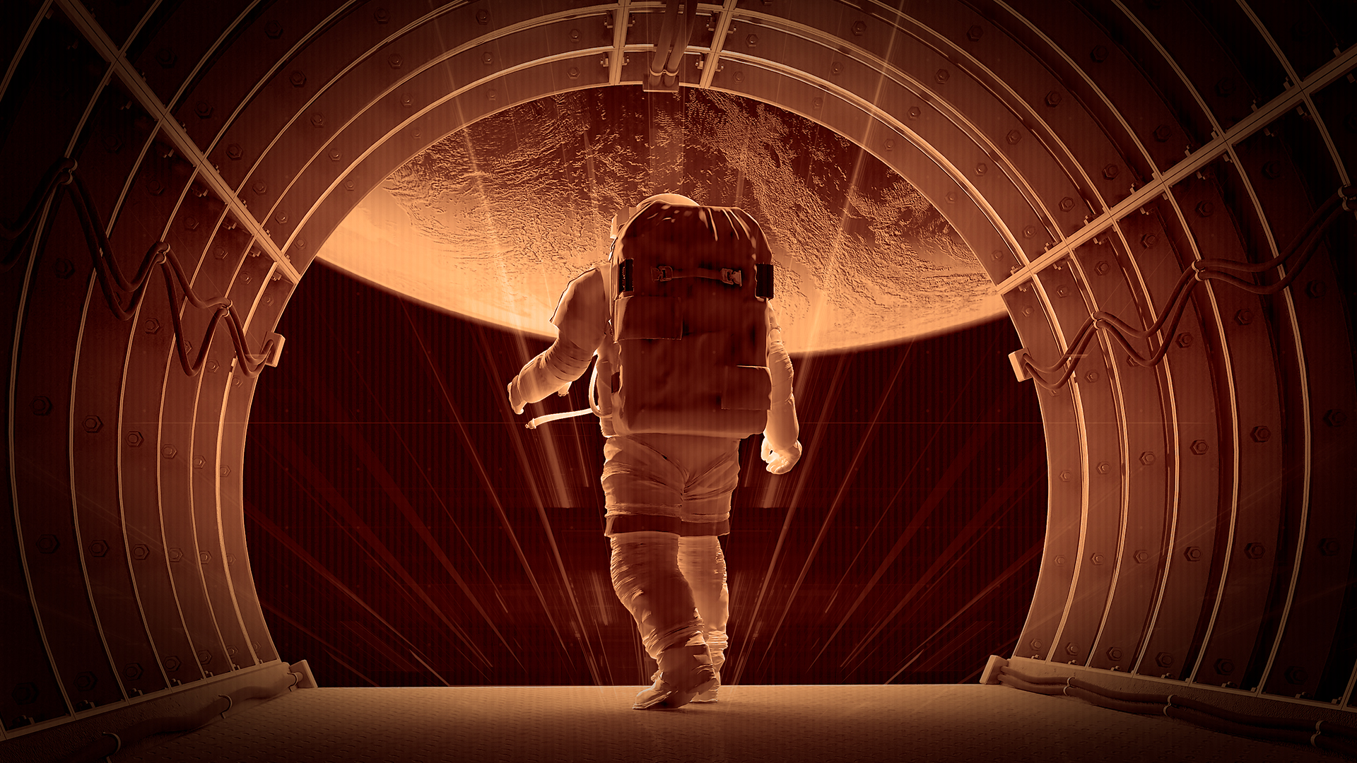
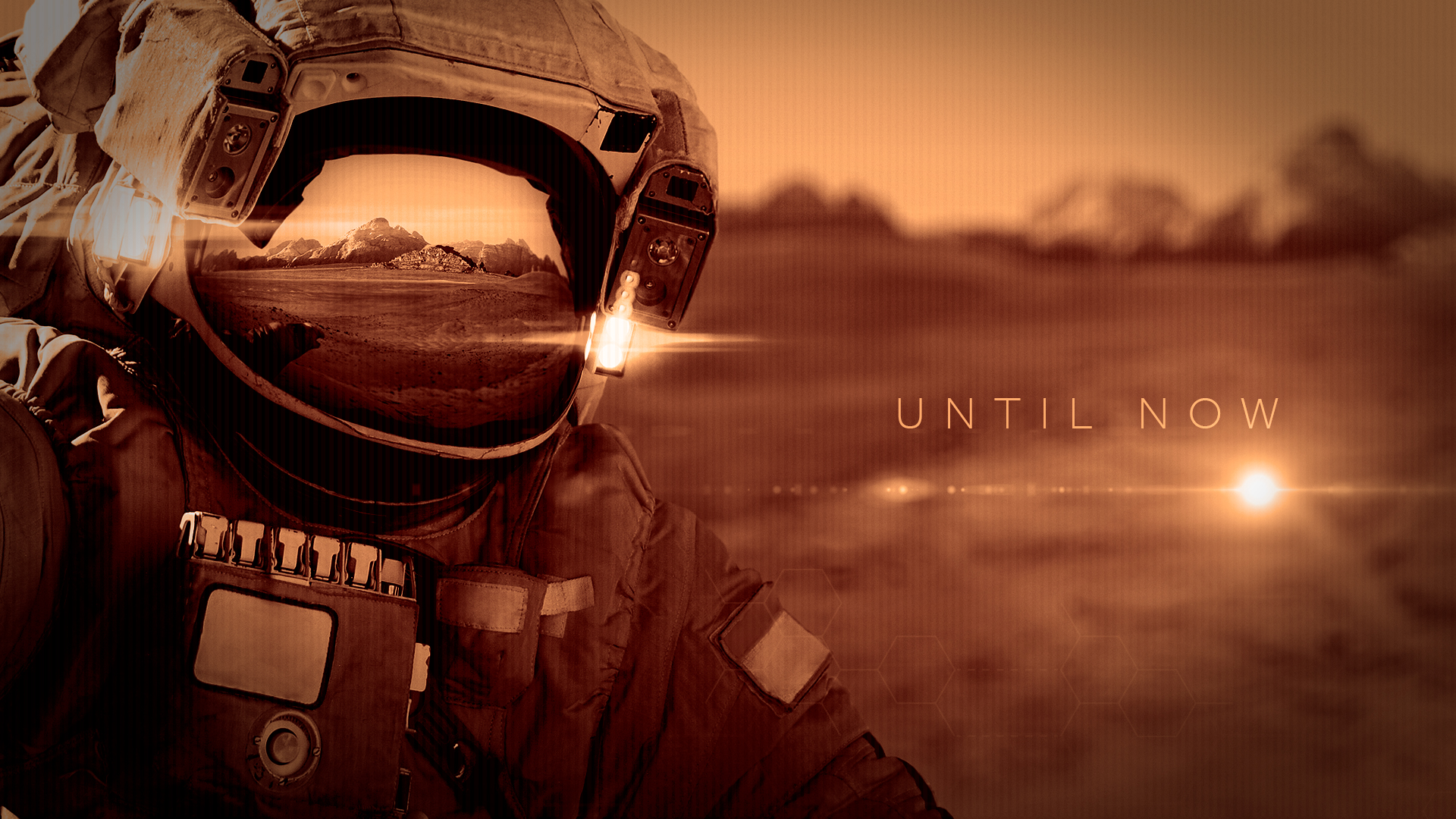
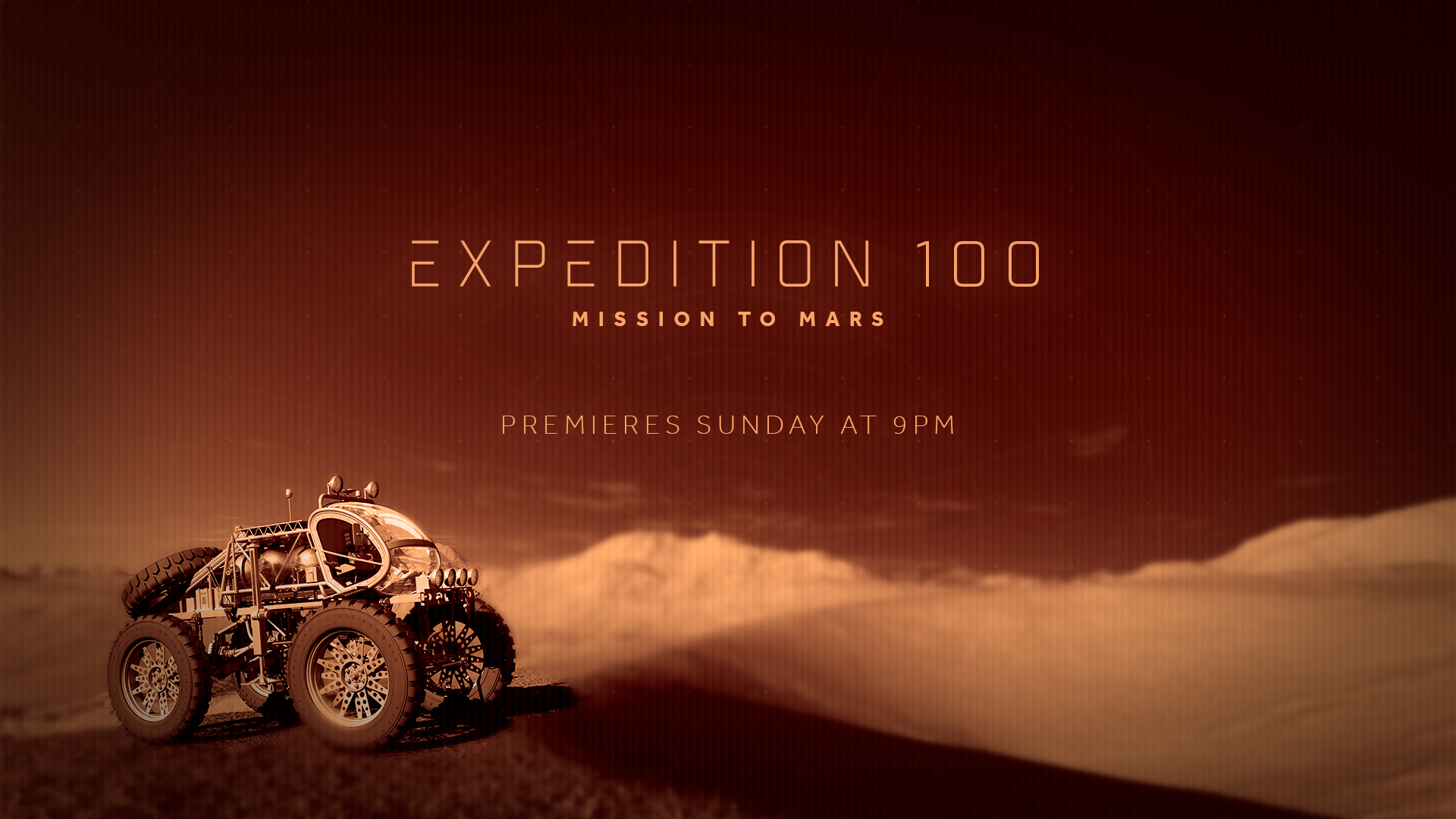
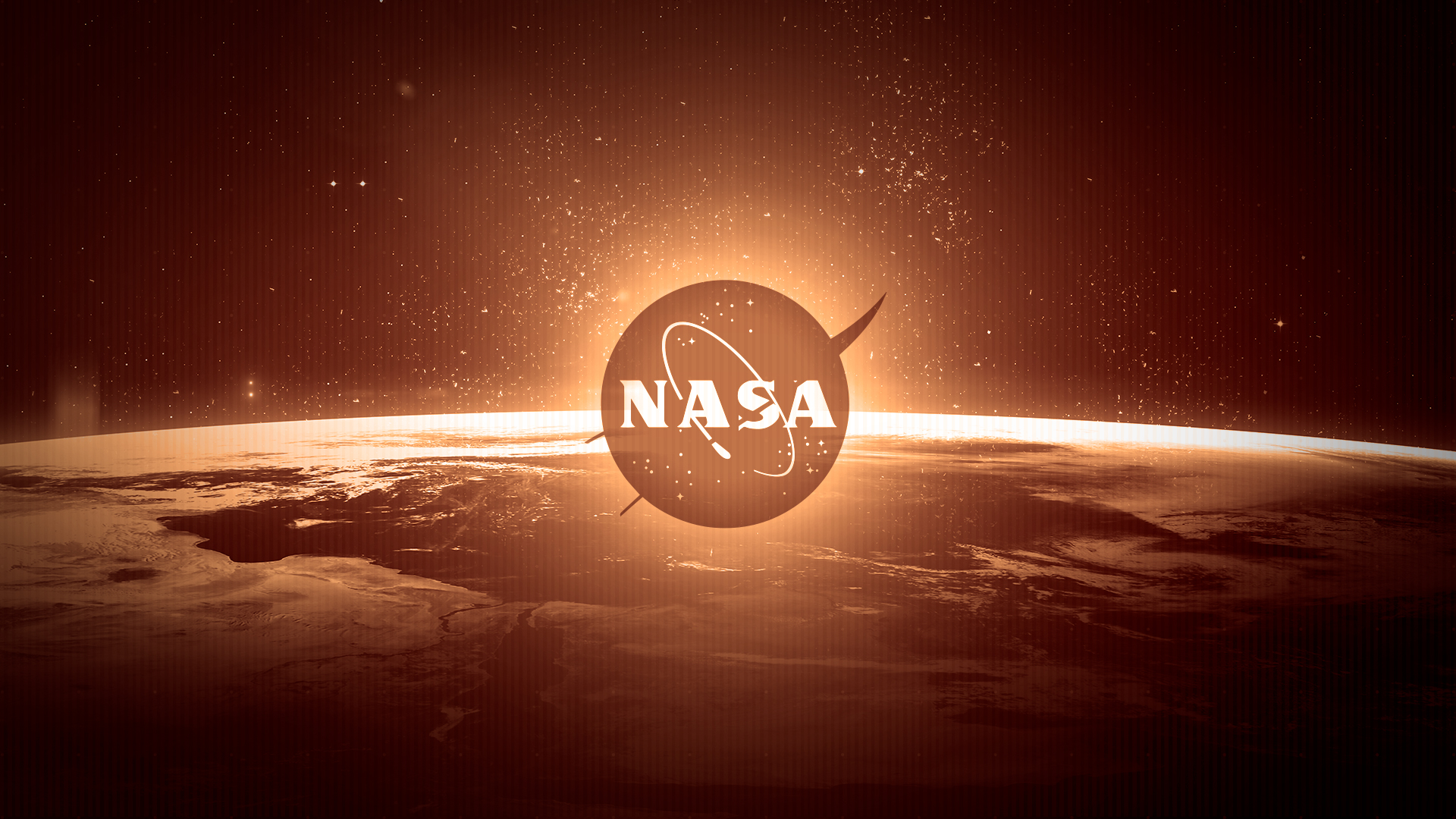
In 2021, I took an intense and challenging course from School of Motion called Design Bootcamp. This is one of my homework assignments, and it’s my favorite series of styleframes I created during the semester. I was responsible for all aspects of the design process—I crafted the art direction, selected imagery, created the UI elements, and designed the artboards.
In a fictional scenario, NASA requested styleframes for a 30-second promo for their show about a mission to Mars. The promo should feel awe-inspiring, cinematic, and slightly dangerous. They wanted to include FUI elements in one of the shots, and they also wanted to see how I would treat the styleframes for the title card and logo. The promo should appeal to their main demographic: ages 25-65, skewed male.
I designed the flow and pacing of the styleframes according to the script provided in the design brief.
“Mars. The red planet is cold. Unforgiving. Uninhabitable. Until now. Be there as NASA TV takes you on a thrilling and historic mission to Mars. Expedition 100. Premieres Sunday at 9pm on NASA TV.” Audio Voiceover, Expedition 100
