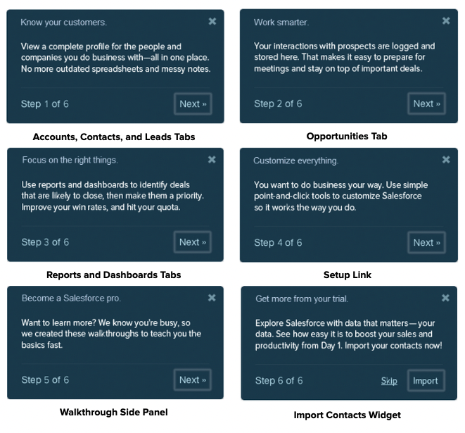
In 2013, Salesforce formed a development team to redesign the CRM Free Trial experience. At the time, the Salesforce free trial lacked any kind of in-app onboarding or guidance, so prospects were often overwhelmed or confused by the experience and unsure how to get started.
The new product manager for the Trials team hypothesized that conversion rates would improve if the onboarding experience highlighted the value and benefits of the product during the free trial. The team developed a new walkthrough component that could be used to design product tours for the different Salesforce buyer personas.
The primary business goal of this project was to boost conversion rates for the CRM free trial.
By working with the Data Intelligence team, the product manager discovered that trial users who imported their contacts into Salesforce were way more likely to make a purchase. So a supporting goal of the product walkthrough was to encourage prospects to import data into Salesforce.
One of the personas for the free trial experience was sales reps. In the new onboarding design, prospects had to select their role in their organization during the trial signup process. If a user selected Sales Rep, then the new product tour would launch and show them how sales reps benefit from using Salesforce.
In 2013, I was the Salesforce Content Experience team’s content strategist. The Trials team asked for my help to craft the content for the sales rep walkthrough.
To develop the content, I followed this process:
Before writing the content, I considered these factors:
Sales reps care about selling. Period. In fact, many reps view CRMs as an obstacle to selling. In their minds, completing data entry takes time away from their interactions with customers. To engage with reps, we have to convince them Salesforce will help them make sales and be more productive.
Our prospects are domain experts, but they’re not product experts. It’s safe to assume they have zero (or very little) experience with Salesforce. We don’t want to confuse users with Salesforce jargon. The content should cater to the absolute novice.
We want the user to test drive Salesforce and engage with all the steps of the walkthrough so we can show them sticky, valuable features. More importantly, we want users to import their own data because it increases the likelihood they’ll make a purchase.
The content is delivered through a series of callouts, so brevity is critical. It’s easy to dismiss the callouts; if the content isn’t engaging or helpful, the user might abandon the walkthrough.
To put myself into the user’s mental state, I imagined a sales rep sitting at her desk. She’s the best rep at a startup with about fifteen employees, and recently she’s been thinking a CRM might help them increase sales. She’s finally found a few minutes between customers calls and meetings to sign up for a free trial. But Salesforce seems expensive for a small business. Is it worth it? And the company she works for doesn’t have a dedicated IT person. It’s likely she’ll bear the burden of setting up Salesforce and getting her coworkers to use the system. That could overload her already hectic schedule.
Given the situation, the user is likely experiencing one or more of these emotions: interest, anticipation, optimism, skepticism, and worry.
When designing the content, we focused on empathy and persuasiveness. We used positive, reassuring language to minimize feelings of anxiety. To keep the user from getting overwhelmed, we emphasized simplicity and ease of use, and employed familiar words instead of Salesforce jargon.

Here’s how this content is crafted perfectly for a walkthrough aimed at busy sales reps who are evaluating Salesforce:
The walkthroughs in the new CRM Free Trial experience boosted conversion rates for prospects, so the content was successful.
The walkthroughs also won an STC award for documentation excellence, and I included this content in the Salesforce Voice and Tone Guidelines as an effective example of UX Writing.