In 2018, I was working as a content strategy consultant for the Salesforce Content Experience team. My manager asked me to create a new set of internal guidelines and resources, so I reviewed the team’s website to determine where to put those resources. That process uncovered a deep problem with the team’s documentation.
The team’s main internal website was a Google Site created in 2008. In addition to being full of outdated and duplicate information, it also had no structure. The site had grown to 700 pages, and almost 200 of those pages existed at the root level of the site’s architecture. The site map had no organization and no hierarchy, so it was impossible to navigate.
The poor structure spawned other problems. Because people had grown frustrated with the Google Site, some team members launched smaller, separate Confluence sites dedicated to specialized topics. By 2018, the team was maintaining 4 separate sites, which contributed to a confusing user experience. Also, the team’s most valuable and important guidelines weren’t available on any of the wikis—the information was trapped in Quip, Google docs, slides, and spreadsheets. That information was not searchable on any of the wiki sites.
Every year, the Content Experience team surveys its hundreds of members to gather feedback for improving processes and tools. Repeatedly, the state of the team’s internal documentation came up as a pain point. Writers were losing time and productivity looking across multiple sites for information they couldn’t find. It was also contributing to a sense of frustration. Tackling this problem would save time, address one of the team’s pain points, and improve the experience of team members.
I successfully made the case to Content Experience leadership that it would be worth the investment of time and resources to overhaul the team’s internal documentation.
My proposal was to design a consolidated team website with a brand new information architecture informed by user research. The overall goal was to create a useful, usable website that improved productivity and made it easy for Salesforce content creators to find the information they need to do their jobs.
Another goal of the project was to create a scalable, future-proof structure for the team’s documentation. No matter what content would be created in the future, there should be a logical place for that content to live in the information architecture.
This was a massive endeavor that took months of work to complete. Over the course of the project, I produced these deliverables:
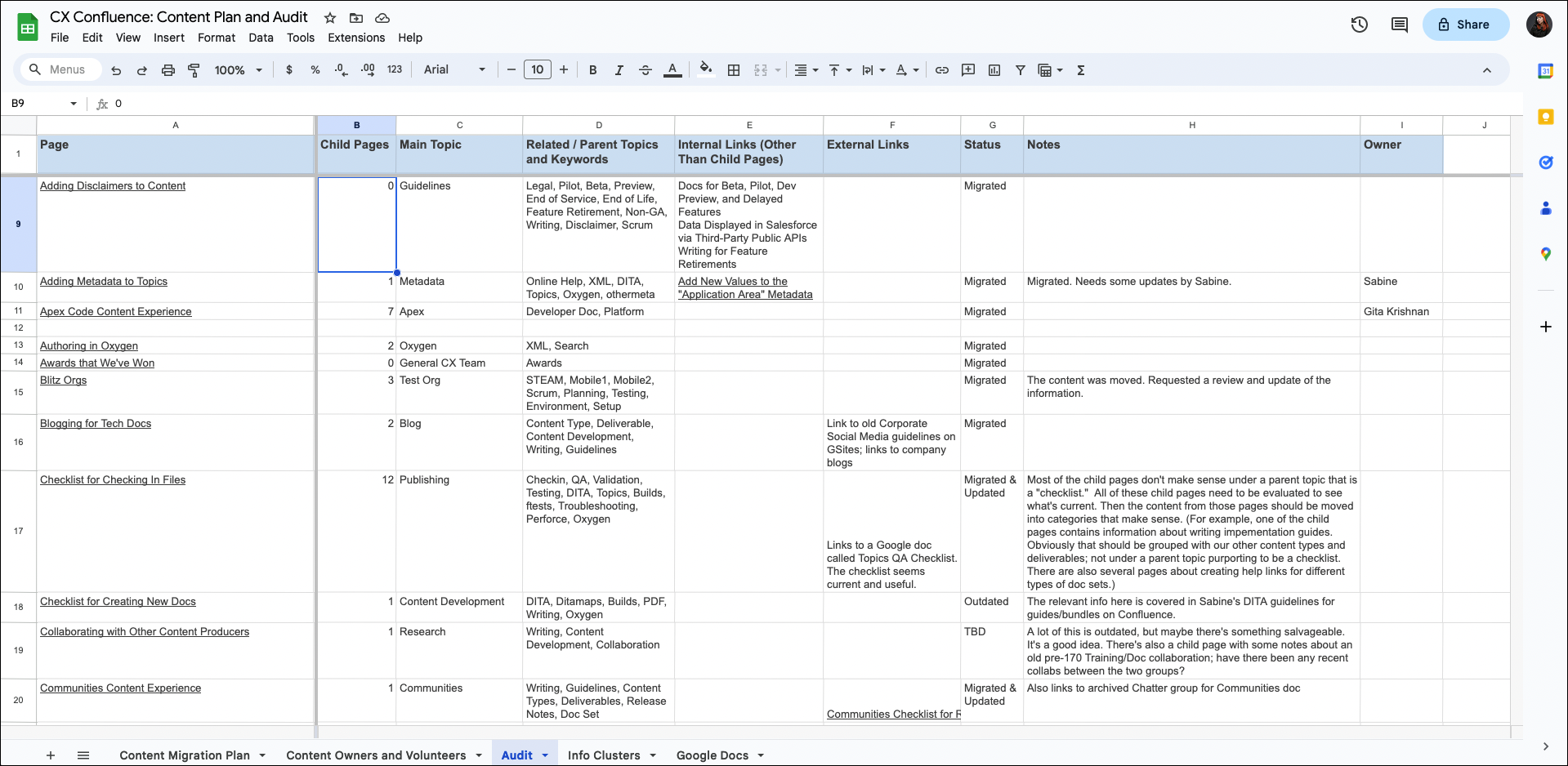
The first step was to inventory and audit the content to evaluate its accuracy, relevance, and quality. I spent several weeks reviewing and cataloging hundreds of pages across all of the team’s websites. In a spreadsheet, I captured details about the content, added notes about its quality, and I made recommendations to keep, update, merge, or delete the pages. I also mined the content for keywords, terminology, and categories to inform the site taxonomy.
Next, I planned and conducted research sessions to inform the information architecture of the new website. I used two research methods: interviews and card sort studies.
The Card Sort Study
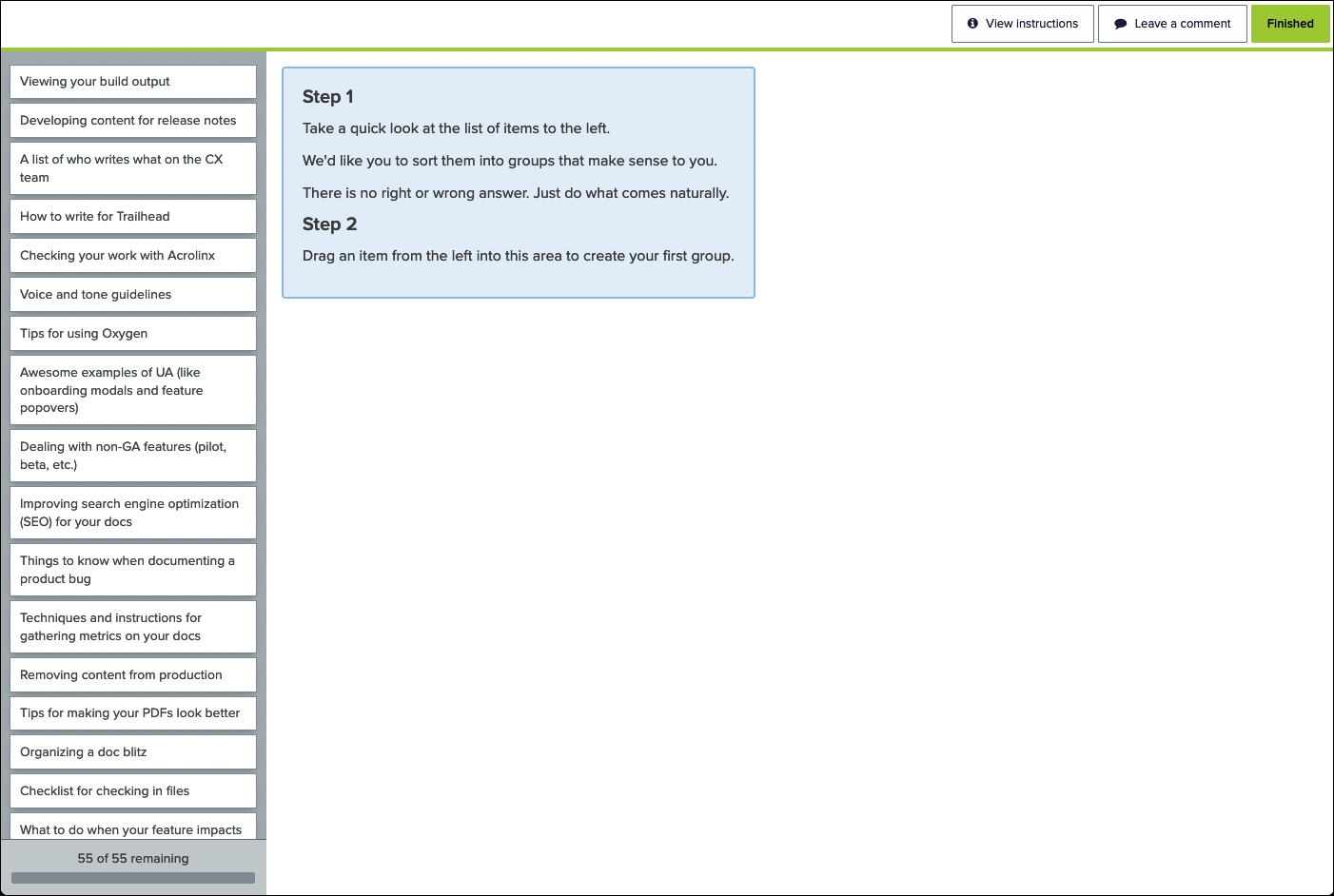
I used Optimal Workshop to run the card sort study over a period of 2 weeks. I performed 16 moderated open card sort studies, each about 45 minutes in length.
Card Sort Findings
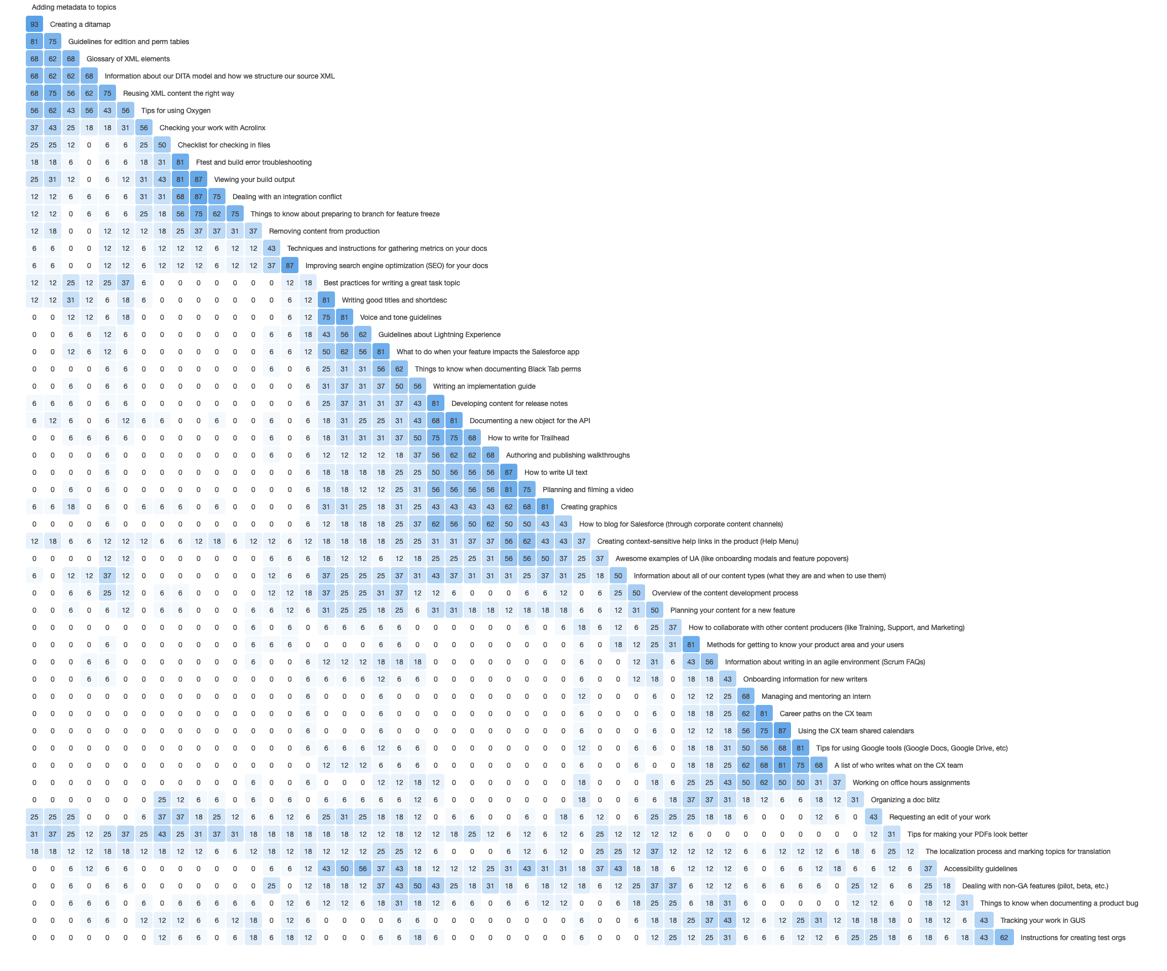
After completing the study, I reviewed both the qualitative and quantitative data. In addition to doing my own analysis, I used Optimal Workshop’s tools to identify strong card pairings and potential information groupings. The diagrams below—the similarity matrix and the dendrogram—show common clusters of cards across participants.
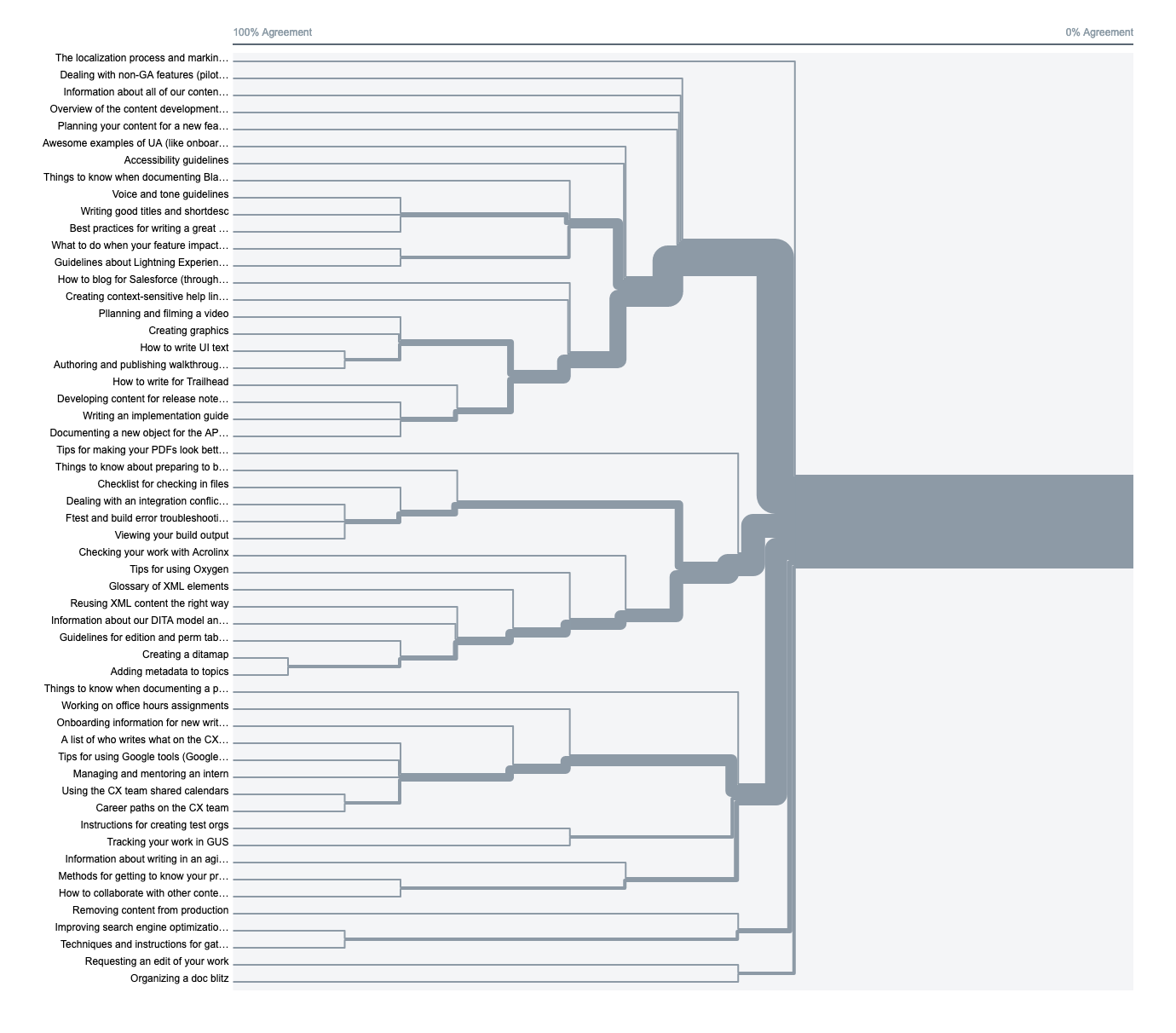 Card Sort Analytics: The Dendrogram
Using a data-driven approach added greater depth and dimension to my analysis. It also made a more compelling case when presenting the new information architecture to stakeholders and team members.
Using the data and insights collected from the interviews and card sort study, I identified 6 main information categories for the team’s knowledge:
Those categories became the root level of the site architecture. Once the top level of the information structure was in place, I was able to create the sub-categories of the hierarchy and organize the content accordingly.
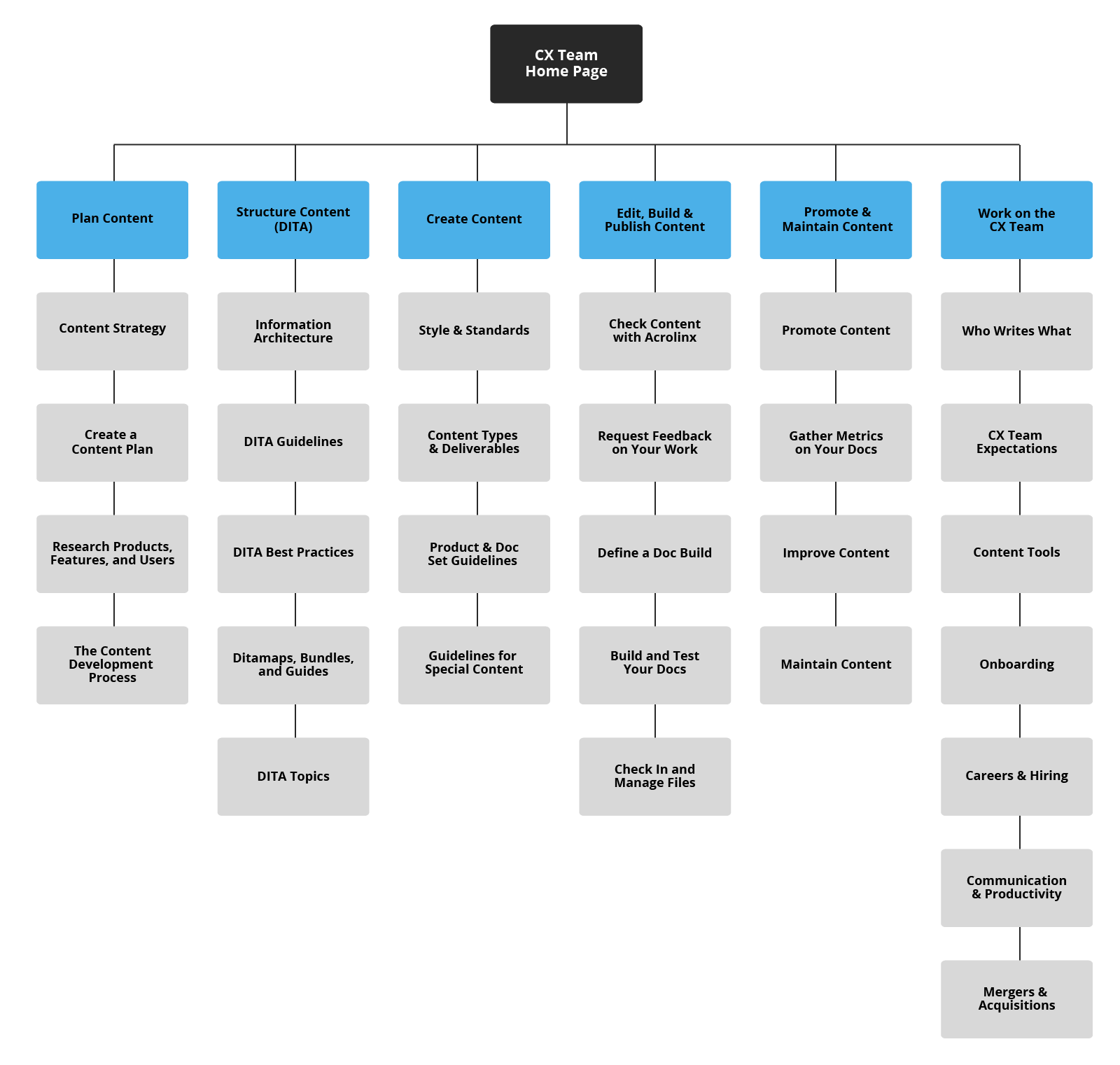
After developing the preliminary information architecture, I validated it by running a closed card study.
I showed participants fifty cards representing information on the wiki, and I asked them to identify the category where they’d expect to find that information. Participants were able to correctly guess the location of the content 88% of the time. Considering that team members could rarely find what they were looking for on the existing wiki sites, the usability of the new information architecture was quite an improvement.
When the information architecture had been validated, I presented the new site structure to stakeholders and gathered feedback. Then the team approved the IA.
When designing the website’s homepage, I adhered to Salesforce’s brand guidelines and visual language. Using Adobe Illustrator, I created two versions of the homepage, and I gathered feedback on both designs from users.
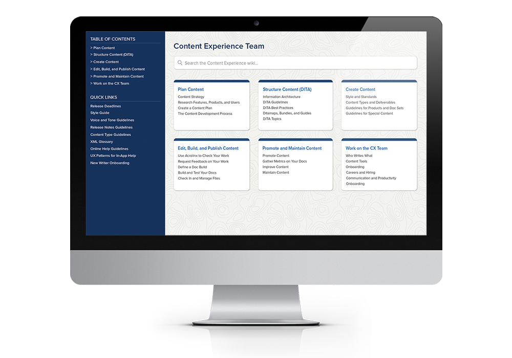
In both versions, the first level of navigation represents the 6 main information categories of the site, which helps users quickly recognize and select the appropriate section of content.
Based on my user interviews, I discovered that there were a handful of resources and guidelines that users frequently accessed, so I surfaced those links as a secondary level of navigation. The location of the secondary links is different in Option 1 and Option 2.
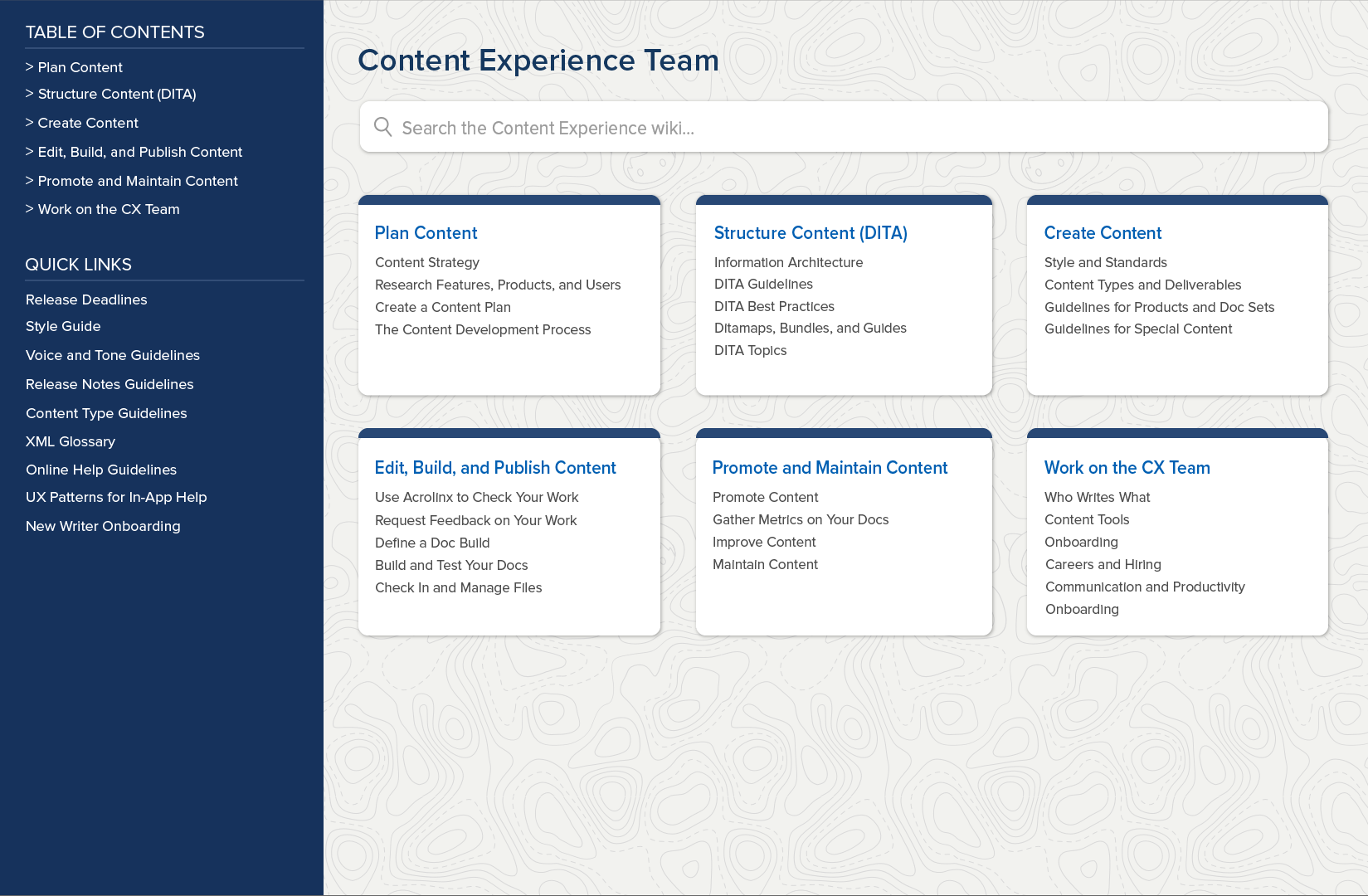
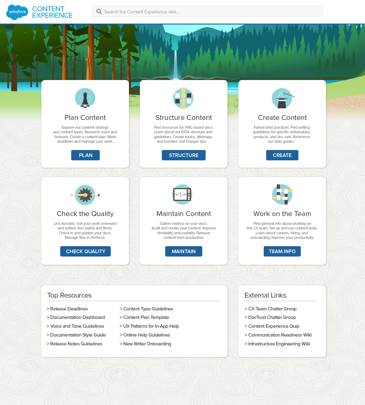
In the end, it was the limitations of Confluence that determined the final design of the homepage. At the time, Confluence’s page layout tools were primitive and clunky, which made it impossible to implement either version as originally designed. The final design used the navigation and layout of Option 1 and the colorful banner idea from Option 2.
Next, I created the new Confluence site for the team, and I built out the site structure by adding pages for every level of the hierarchy.
With the architecture in place, I then spent months manually migrating hundreds of pages of information from the old wiki sites to the new Confluence site. Following the results of my audit, I merged, deleted, and updated content as I went. In the rare cases where the existing content had a clear owner, I asked the owner to review the documentation and make updates.
I also identified the most useful Quip docs, Google docs, spreadsheets, and slides owned by the team, and I extracted the relevant information from those external sources and added it to the new site.
During the audit stage, I identified content gaps where certain team processes, tools, and standards weren’t documented. After the migration, I planned and wrote dozens of new wiki articles to supplement the existing information, including sections about content strategy, user research, online help guidelines, and content curation and maintenance.
By the time I was done with the migration and the production of the new content, the consolidated Content Experience team website had 1,100 pages of accurate, relevant, and useful information.
When the site was completed, I invited a small group of team members to beta test the new information architecture. After receiving positive feedback from beta testers, it was finally time to launch the site.
Change management is critical to the success of any project. To support the rollout of the new Confluence site, I did the following: